
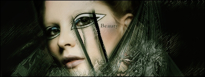
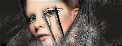
Art Beauty signature
In this tutorial we will be learning how to make this abstract Art Beauty signature.
Step 1 –Start by opening a new file and use the sizes you prefer. Size on this tag is 400×150 px.
Fill your background with a darkish grey (#6c6964 in this sig)

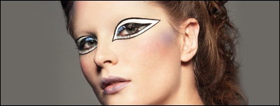
Step 2 – Now bring out your stock and paste it in a new layer (ctrl+shift+N). We used this. If needed move it around a bit and resize it by clicking
ctrl+T if needed. Hold shift then and drag one of the corners inside to make it smaller (holding shift contains your proportions).
Then take out your eraser tool and erase all the unwanted parts. In this case, we erased all of the background and kept
the girls face.
Step 3 – Now, the next step might be hard, but the most important thing to do is to use your imagination. So make a new layer (ctrl+shift+N)
and now you can do 2 things.
Either you take out a fractal brush that you like and brush a bit to create some flow or you can search up another stock picture,
preferably abstract-like and paste that into the new layer and then erase everything you don’t like. Additionally, you can also skew the stock
(edit < transform < skew) to alter the shape a bit. Now when it comes to the colors, we’re gonna color it later so when your brushing,
do so in a grey/black color and when you do the stock method, desaturate your stock by going to image < adjustments < desaturate
(ctrl+shift+U)

Step 4 – Make a new layer (ctrl+shift+N) and paste in your original stock again. Now we’re gonna apply a filter to it, to create some more detail
on the background. So go to filter < sketch < chrome and play around with the settings a bit. This looks a bit bland so we’re going to add an extra effect to it. Go to filter < brush strokes < ink outlines and mess with the settings
until you are pleased with what you have.
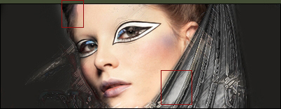
Then move your stock around a bit to find some nice pices on it and then erase everything you don’t like. When it comes to erasing, try
to use a soft round brush with a lowered opacity and flow, this way you can have better blending when erasing.

As you can see, erased quite a bit here. The whole idea is just to give that tad bit of extra in the end

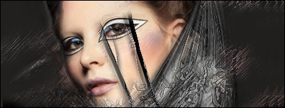
Step 5 –Create a new layer (ctrl+shift+N) and get out a C4d. In general, every type of C4d will do but we used a kinda fractal like
C4d in this sig. The color we used was red, this will give a nice effect in contrast with the grey.
So when you’ve placed in your C4d, set it’s blending mode to lighten and erase everything you don’t like, such as on her face.

Step 6 – The next step is again about find a nice stock picture. We’re going to add a bit of grunged effect to it, so try looking up some
texture stocks. Once that you found one that you like, paste it on a new layer (ctrl+shift+N) and erase a lot of it. Again, it’s
just to add detail and depth to the background. Also, set that layer to lighten.

Step 7 – Make a new layer (ctrl+shift+N) and go to image < apply image. This will combine all your previous layers into one. Go to
filter < brush strokes < sprayed strokes and play with the settings, make sure the directions of the sprays matches your flow.
Next, we’re going to add the ‘ink outlines’ filter again, so go to filter < brush strokes < ink outlines.
Yes, it tends to come on a tad strong, so don’t be afraid to erase unwanted parts, such as on the face and slightly erase over the
rest with a soft brush (lowered opacity and flow) to reduce the effect there, but to still have it present.

Step 8 –New layer again (ctrl+shift+N) and apply the image once more (image < apply image). Then add the chrome filter again.
Filter < sketch < chrome. Now, erase almost everything, just keep a few touches of it to soften out some parts.
Set the blending mode of that layer to lighten. As you can see, not much of the filter has been
kept, but it does give that little bit of extra to
the sig.
Step 9 – Make a new layer layer (ctrl+shift+N), take out your paintbucket tool and fill it with black. Meaning of this layer will be to
create shadows and to enhance existing shadows, so erase some main parts and then take out the soft eraser brush wit lowered
opacity and flow again. As you can see here, we allready have some shadow on the left of her faces, so we can slightly enhance this
effect by erasing some of the black there, but not all off course. We also added some shadow around her eye there, as extra detail. As you can understand, hard to explain how to do it, since it will be different for every stock.

Step 10 – More filters will follow on the next layer, so start off by making a new layer (ctrl+shift+N) and applying the image (image < apply image).
First filter will be the ‘find edges’ filter, so go to filter < stylize < find edges.
Next will be to add some sprayed strokes. Go to filter < brush strokes < sprayed strokes and mess around a bit there, but keep a fairly
high spray radius.
And for the final filter, we‘re gonna sharpen it, so go to filter < sharpen < sharpen.
After those filter, set you layer’s blending mode to lighten and reduce the opacity to 20%. All you need to do now is to erase all the part
you don’t want.

Step 11 – Now repeat that previous step. But set the opacity to 50% this time.

Step 12 –New layer (ctrl+shift+N) and apply the image (image < apply image). Now, you see the part of stock on the right of her face,
the stock/fractal brush from one of our very first layers. We’re gonna do something with it again. Press ctrl+T on your applied image
layer and flip around your image a bit (go outside the square with your mouse and an arrow should appear, which allows you
to flip the image.
Find the position you like and erase everything you don’t like.

Step 13 – Filter time again. Make a new layer ctrl+shift+N) and apply the image (image < apply image). First, desaturate (ctrl+shift+U).
First filter will be the ocean ripple. Go to filter < distort < ocean ripple and play around with the settings a bit.
Then go to filter < brush strokes < sprayed strokes and make sure the direction follows your flow.
As final filter, go to filter < brush strokes < ink outlines.Again, erase all the parts you don’t like and maybe move it around a bit. Let your imagination go wild 

Step 14 – New layer (ctrl+shift+N) and apply the image once more (image < apply image) Now move it a bit to the left.
Step 15 –New layer again (ctrl+shift+N) and apply the image (image < apply image) Go to filter < brush strokes < sprayed strokes.
Play around with the settings and again make sure your direction goes with the flow.
Then set that layer to lighten and move it around a bit and as usual, erase all the unwanted parts.

Step 16 –Make a new layer (ctrl+shift+N) and apply the image (image < apply image). Simply reduce the opacity of this layer to 10%. This gives a slighty softer look to your sig.

Step 17 – Now we’re going to repeat some steps we did in the beginning. Look up another abstract-like stock and paste it on a new layer (ctrl+shift+N)
Desaturate it (ctrl+shift+U) and go to filter < brush strokes < ink outlines. After that, go to filter < sharpen < sharpen.
Then set that layer to lighten at 30% and erase all the parts of it that you don’t like and also move it around a bit maybe.
Like said before, use your imagination!
Step 18 –And now it’s onto the easy part 
Time to do some coloring, so add a gradient map. To do so, click on the little black&white orb (New fill or adjustment layer) in the bottom of your layers palette window. Then click on gradient map and choose the black to white one.
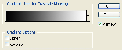
Set that layer to multiply on 40%

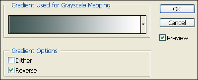
Step 19 – Add another gradient map, this time a blue-ish (#3f5654 in this case) color to white. If the blue isn’t you foreground color, simply
tick off the reverse box.
Step 20 – Turn the blending mode of that layer to soft layer and reduce it’s opacity to 50%
Step 21 – Now add another gradient map and this time we added another home made gradient. You can either take this one, or experiment
yourself. Of course, that later is highly encouraged. To make your own gradient, simply click on one of the premade ones and you will be taken to it’s edit screen where you can adjust and
save it then.
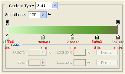
Set that layer to soft light, at 50% opacity.

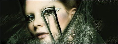
Step 22 – Make a new layer (ctrl+shift+N) and apply the image (image < apply image). Then go to filter < blur < gaussian blur and blur it by
a 2 pixel radius. Then reduce the opacity of that layer to 20%

Step 23 – Make another new layer (ctrl+shift+N) and apply the image once more (image < apply image). Next, go to filter < sharpen < sharpen.
Reduce the opacity of the layer to 30% and erase some parts that you don’t like.
Step 24 – Now add a brightness and contrast layer. To do so, click on the little black&white orb again and choose brightness and contrast.
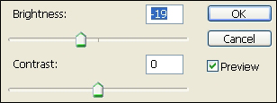
Then reduce the opacity of that layer to 50%. Off course, you aren’t obliged to take those settings, you should play around a bit
and see what’s most fitting for your sig.
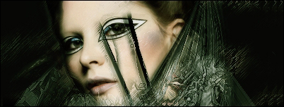
Step 25 – Now make a new layer (ctrl+shift+N) and apply the image (image < apply image). Leve it like that and make another new layer (ctrl+shift+N).
Fill that layer in black and set it to overlay on 50% opacity. Now, while still being on that layer, press ctrl+E, this will merge that layer with your
previous layer.
And then reduce the opacity on your freshly merged layer to 30%. It might be a bit dark on the sides, so if you feel it necessary, just erase some
parts on it that you don’t like.

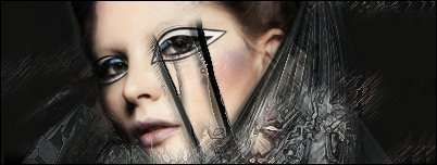
Step 26 –And to finish it up, we’re going to add some text to it. The font used here is Garamond, set to smooth on 12 px.
The color is one picked from the signature (#232d1b here) and then place it somewhere you like.

